
Accessible Sign Up Form for Box
Accessible Sign Up Form for Box
PRODUCT DESIGN
PRODUCT DESIGN
PRODUCT DESIGN
UI/UX
UI/UX
UI/UX
ACCESSIBILITY
ACCESSIBILITY
ACCESSIBILITY
SIGN UP
SIGN UP
SIGN UP
WCAG
WCAG
WCAG
CONTRAST
CONTRAST
CONTRAST
TYPOGRAPHY
TYPOGRAPHY
TYPOGRAPHY
IOS
IOS
IOS
FIGMA
FIGMA
FIGMA
STARK
STARK
STARK

Introduction
Introduction
In this project, I reimagined the Log In and Sign Up flows for Box — a SaaS application — to create a modern, accessible, and user-friendly experience. The redesign focuses on enhancing usability, improving visual hierarchy, and incorporating accessibility best practices.
In this project, I reimagined the Log In and Sign Up flows for Box — a SaaS application — to create a modern, accessible, and user-friendly experience. The redesign focuses on enhancing usability, improving visual hierarchy, and incorporating accessibility best practices.
Problem Statement
Problem Statement

The existing interface presented several challenges:
Outdated UI: The design did not reflect current aesthetics.
Inefficient Use of Space: UI elements were too small and underutilized the available screen space.
Cluttered Layout: Insufficient negative space led to a crowded experience.
Low Contrast: The ‘Log In’ button lacked the necessary contrast for visibility.
Missing Persistent Labels: Input fields lost their labels once data was entered, confusing users.
Weak Focus States: Input fields did not provide clear visual cues when active.
Lack of Real-Time Validation: There was no instant feedback on data input errors.
Missing Social Login: The absence of social login options limited user choices.
No Password Visibility Toggle: Users couldn’t easily verify their password entries.
Defining the Design Goals
Defining the Design Goals
The primary objectives for the redesign were to:
Modernize the Interface: Update the visual style to align with contemporary design trends.
Enhance Usability: Optimize screen space by enlarging touch targets and incorporating clear labels and focus states.
Boost Accessibility: Increase contrast, introduce instant feedback for data input, and add features such as password visibility toggles and social login support.
Streamline the User Journey: Reduce friction by ensuring intuitive navigation and immediate error validation.
Key Design Improvements
Key Design Improvements

Modernized UI
Adopted a clean, minimalist design with updated typography and iconography to boost legibility and modern appeal.
Modernized UI
Adopted a clean, minimalist design with updated typography and iconography to boost legibility and modern appeal.
Enhanced Layout & Space Utilization
Increased the size of interactive elements and leveraged negative space to create a balanced and uncluttered interface.
Redesigned form layouts to improve readability and overall interaction.
Enhanced Layout & Space Utilization
Increased the size of interactive elements and leveraged negative space to create a balanced and uncluttered interface.
Redesigned form layouts to improve readability and overall interaction.
Accessibility Considerations
Accessibility Considerations
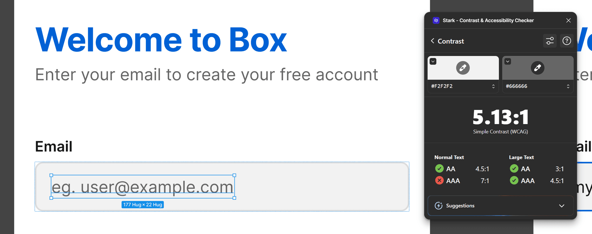
Color Contrast: Ensured that all text and interactive elements meet WCAG AA standards, facilitating easier reading. All contrast ratios were tested with the Stark plugin for Figma.
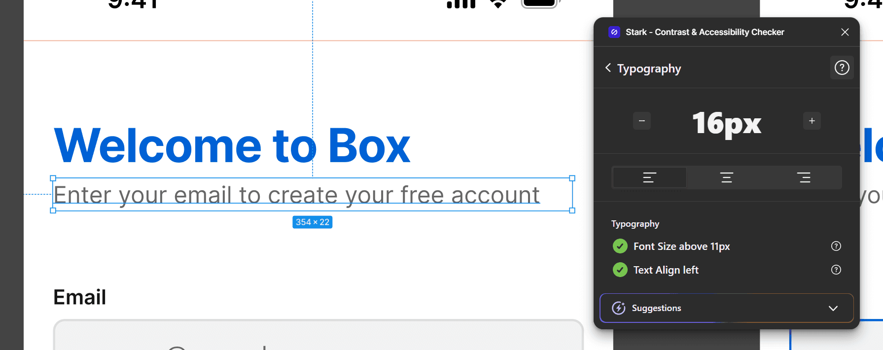
Revised Font Sizes: All text elements have font sizes above 12px, ensuring an easy reading experience.
Color Contrast: Ensured that all text and interactive elements meet WCAG AA standards, facilitating easier reading. All contrast ratios were tested with the Stark plugin for Figma.
Revised Font Sizes: All text elements have font sizes above 12px, ensuring an easy reading experience.
Improved Button Contrast & Visual Hierarchy
Adjusted the color palette to make the ‘Sign Up’ and ‘Log In’ buttons stand out, ensuring they were immediately recognizable as the primary CTAs.
Improved Button Contrast & Visual Hierarchy
Adjusted the color palette to make the ‘Sign Up’ and ‘Log In’ buttons stand out, ensuring they were immediately recognizable as the primary CTAs.
Persistent Input Labels & Emphasized Focus States
Implemented floating labels that remain visible during data entry, ensuring clarity.
Enhanced focus states on input fields to provide clear guidance during interaction.
Persistent Input Labels & Emphasized Focus States
Implemented floating labels that remain visible during data entry, ensuring clarity.
Enhanced focus states on input fields to provide clear guidance during interaction.
Real-Time Validation & Additional Features
Integrated instant input validation to provide immediate user feedback on errors, thereby reducing form submission frustration.
Added support for social log in options and a password visibility toggle to streamline authentication and enhance user confidence.
Find me at


©2025. Akshay Ramnani.
Find me at
©2025. Akshay Ramnani.
Find me at
©2025. Akshay Ramnani.